Financial newsletter
The Contrarian Memo
Investing wisdom, told straight.
Client
The Contrarian Memo
Year
2026
Scope
Brand strategy
Full brand identity
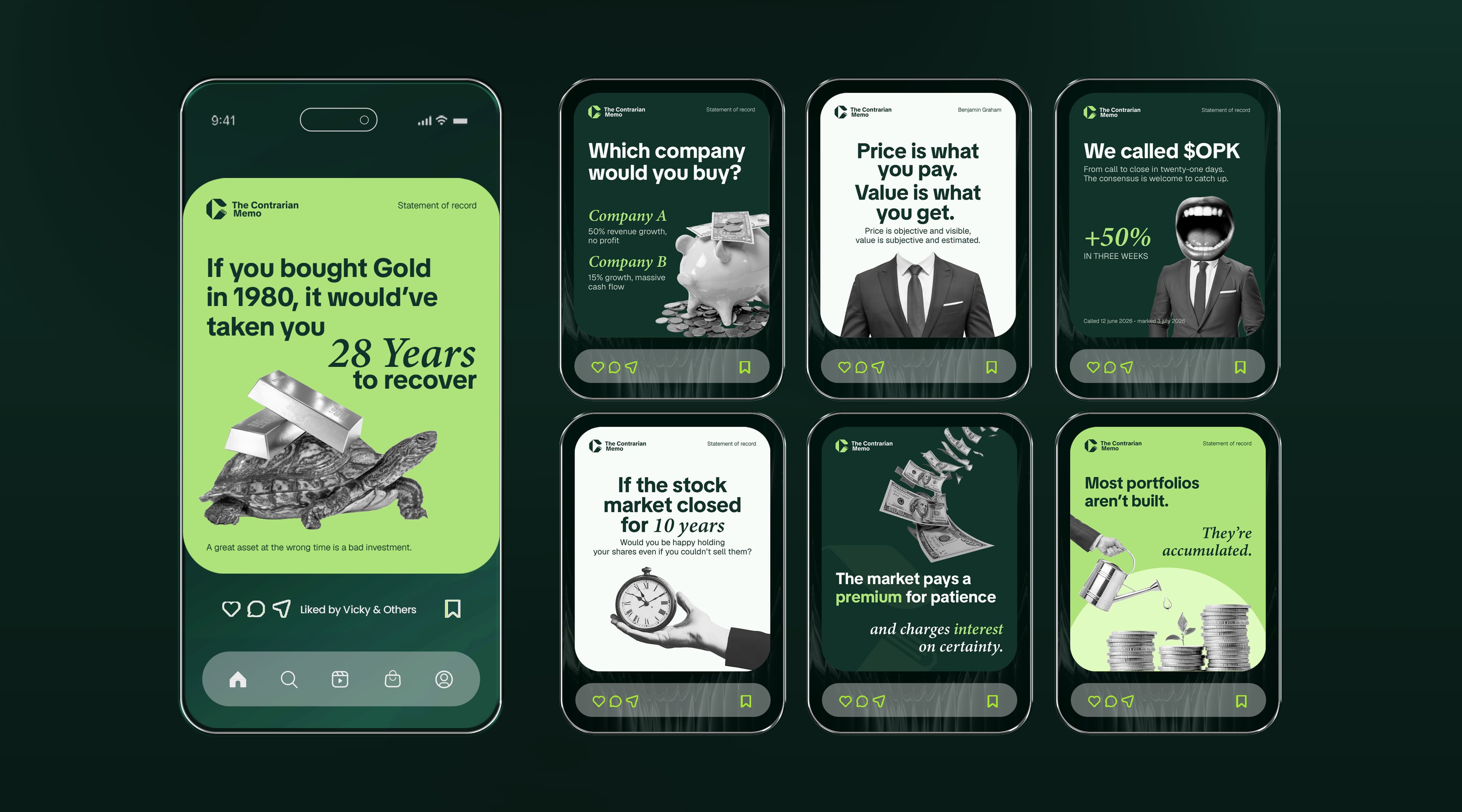
Social media assets
Palette
Challenge
Build a brand for an investing newsletter that could stand out in a feed crowded with recycled market takes, while still reading as credible to a financial audience.
Approach & Strategy
Paired a sharp geometric mark with a confident green palette and a bold, editorial type system, giving every call and market statement a consistent, quotable format across the newsletter and social channels.
Outcome
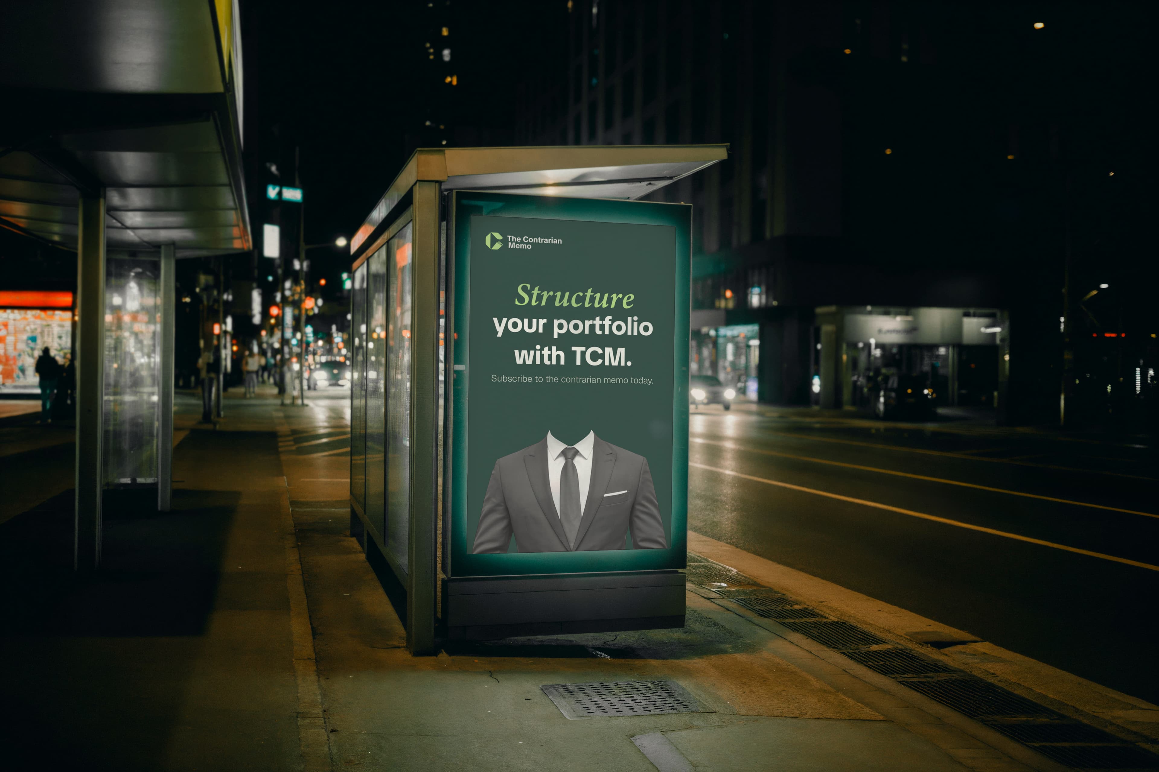
Delivered a full identity system — logo, stationery, and reusable social media templates — that lets The Contrarian Memo publish sharp, high-conviction takes with a distinct, recognizable look.